New app architecture
Restructured the information architecture of TSB’s retail mobile banking app to make existing features easier to find, boosting net promotor scores.
Summary
-
Users didn’t think they app contained what they were looking for because it was hidden in narrow and deep architecture pattern - it was to much effort to find it.
-
Through looking at familiar navigation patterns in the most popular apps, adopting the latest trends and countless rounds of card sorts and user testing a new layout was formed.
-
To prevent big changes for users straight away, causing a big learning curve, the new layout was phased over a year, allowing the technology behind it to evolve to.
-
Mobile NPS improved by 25pts, feature usage increased and customers started asking for new features not existing ones. Moving products to home page also saw a 30% uplift in hits
Can’t find what you’re looking for?
Problem
Reading compliant data, customer reviews and usage figures, I noticed we were often asked for features that we’re available and high drop out rates through journeys.
Flagging the effort to navigate and transact was to high, possibly due to different navigation patterns and behaviours in different features.
Objective
Make the features in the app more discoverable by using the latest mental navigational models and implement a consistent navigation pattern.
Approach
-

Competitor research
What are the most popular apps navigation patterns, what are users used to? Both in banking and outside
-

Feature mapping
What features are available for users - is the e logical groups and existing mental models
-

How do users think?
How would users group the features and where would they go looking?
-
Designs and validation
Combining the input into different iterations and testing to see what performs the best and implement
Taking it up a level or two
What was changed
Shallower information architecture
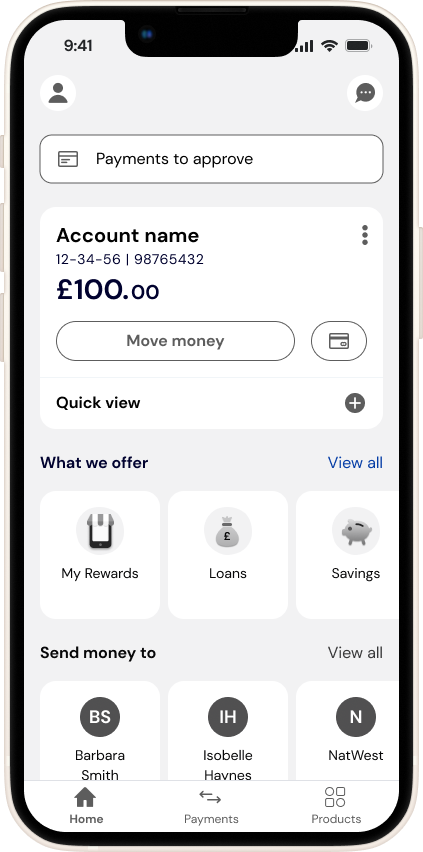
Moved from a deep information architecture with 6 levels of features (eg. some features needed 6 interactions from the home page to access) to 3 by refocusing home page entry points and the first pages of it
User centric groupings
User testing determined the right level of groupings and correct labelling
Followed latest industry standards
Updated UX/UI to industry standard navigation patterns, which then formed templates for consistent behaviour across the app
Phased roll out
To minimise customer disruption, the move to the end state was phased across multiple app releases
Orginal: Features hidden behind hamburger
menu and product tiles
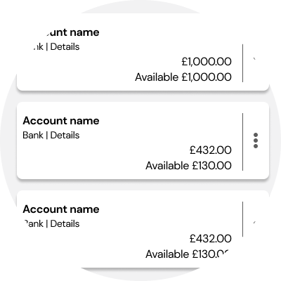
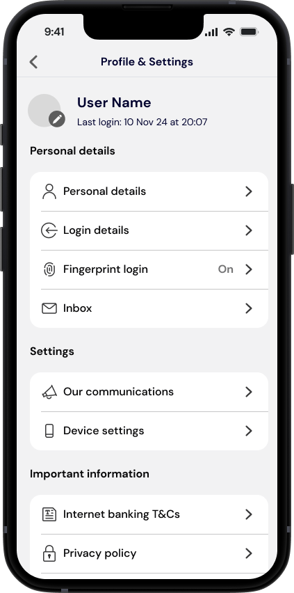
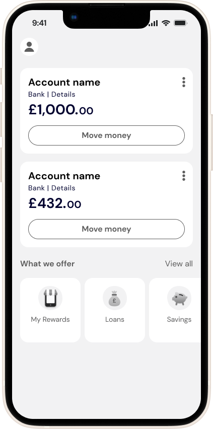
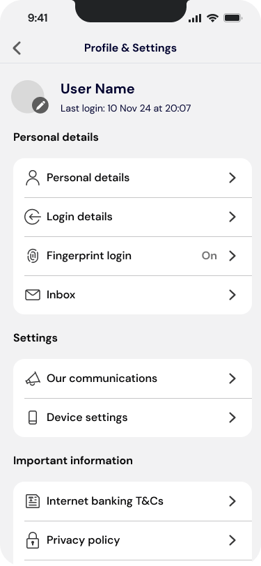
New Profile icon, tile design
and promoting offering
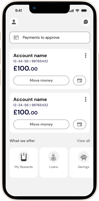
Added Chat to home, online card payments
and new card feature
Introduced bottom navigation with sections
to most used features
Results and continuous learning
Objective achieved
Mobile app NPS grew 25points
Our net promotor increased 25 base points over the phased roll out, despite no other major changes
Change in Customer feedback
They stopped asking for existing features to new ones - helping us determine our roadmap
Product sales uplift
Our products sales page saw a 30% increase in visits by adding it to the homepage
Demonstrated business value of good UX/UI
Built trust in the process, helping us have a bigger voice in the decision making process
Acting on feedback
Overall, the project was a success, but there were a few issues
Logout button in the wrong location
Our log out button wasn’t tagged and customers were using native behaviours which the dev team removed - so we needed a quick fix in the next release
New payments tab less successful
As the move money button on the product tile became the main entry point to make a payment, meaning customers miss out finding other features in the tab, like depositing cheques or sending money abroad. Once the new core payments are built we can slowly migrate to the hub through redirections
Chat became defacto help and support
The Help and support centre phase was replaced with a chat entry point, aiming to reduce call centre volumes - but the AI chat is not deflecting enough FAQ style questions and overwhelming Agents and service levels
