Apply for a loan
Objective: Make a mobile app loan application journey for existing customers, as frictionless as possible
Summary
-
Users could apply for a loan on our website, but not our app. Conversation rates were poor and the journey was not optimised for mobile.
-
It was the first project to be delivered using agile, with the first in house designer and new engineering team.
My role as the UX designer was to create full wireframes, complete all user testing and over see the UI designer, whilst meeting all the stakeholders requirements.
-
There was a 30% uplift in conversion rate, materially changing the amount of loans sales - with great customer feedback on how simple and clear it was to do.
The goal & design process
Objective
Using the exiting web journey as a starting point - create a new native app Loans application for existing customers, which was simpler to use, accessible and drove greater conversation
Design process
Requirements gathering
Speak to key stakeholders to understand what’s in scope and out of scope. What does the journey need to cover from a legal and risk
Analysis
Reviewing existing web journey to understand pain points and drop outs. Gather competitor analysis to see how they compare, what works well and what to avoid. Identify target segment customers to test with including any particularly vulnerable groups
Understanding the users
What are their needs, motivation and mental state when looking to take out a loan. What’s important to them at every stage from looking at something to buy to the money in being in their account
Draft wire framing
Start pulling together high level flows, overlaying key information / requirements, considering accessibility, often with a few variations or options to explore
Iterate & Test
Review with stakeholders, developers and validate with users to refine the wireframes, working through different scenarios to ensure error scenarios are handled well
Sign off and handovers
When ready, stakeholders are taken through and approve the flow and copy. It’s then working with the UI designer to translate the wireframes into dev ready screens to hand over
Develop, test and release
During the build phase, constantly on hand to answer questions, review sprint demos to feed back UX/UI defects and make any tweaks
Monitor and improve
Once live, monitor the journey performance and feedback to make adjustments and improvements following the same process, but quicker
Considerations
Highly regulated product
It needed to include certain fields, numbers had to be of equal prominence, multiple legal documents and wording (sometimes saying the same thing!) and avoiding certain financial promotion triggers
Technically limited scope
I couldn’t change anything fundamental, such as ‘section’ orders, as it used the same rails as the web journey
Cultural perception of how to design
Stakeholders not used to working with a designer, often giving instructions on what they thought best, rather than iterate and test
User testing
Goal
Be really comfortable user’s understood what they were doing and making an informed choice.
Approach
Each step of the journey was rigorously tested
Using a variety of methods. From surveys on what information is helpful when choosing a loan, click tests to compare layouts options to moderated sessions with vulnerable user groups.
Validate stakeholder concerns
I’d also ran unmoderated talk out loud’s to validate or elevate stakeholder concerns, with follow up surveys if a bigger sample size was needed.
Unhappy paths were also tested
To check users understood the reasons why their loan was being declined - and explore what information would be helpful for them.
Feedback loop
The results were constantly fed back into the wireframes until the journey had consistent positive feedback, legally compliant and accessible.
Deep dive:
Legal documents
Challenge
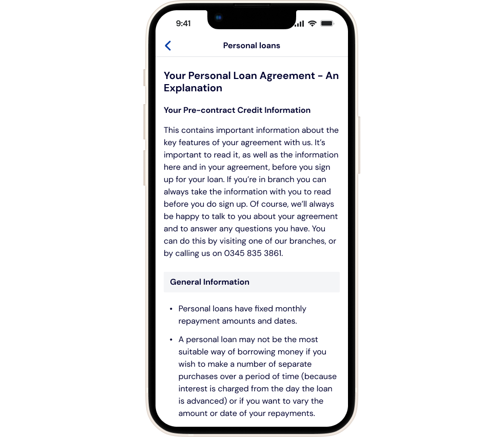
Large amount of text
Over 3,000 words meant long scrolls & page analysis showed user’s often only scanned the top & bottom
Duplication
Includes 3 legal documents largely covering similar content, adding confusion - haven’t they already done this?
Different behavioural patterns -
Some users want lots of details, other’s just a summary or none at all
Anxiety generating
Vulnerable user groups felt overwhelmed by the cognitive load
Results
Copy reviewed & reduced
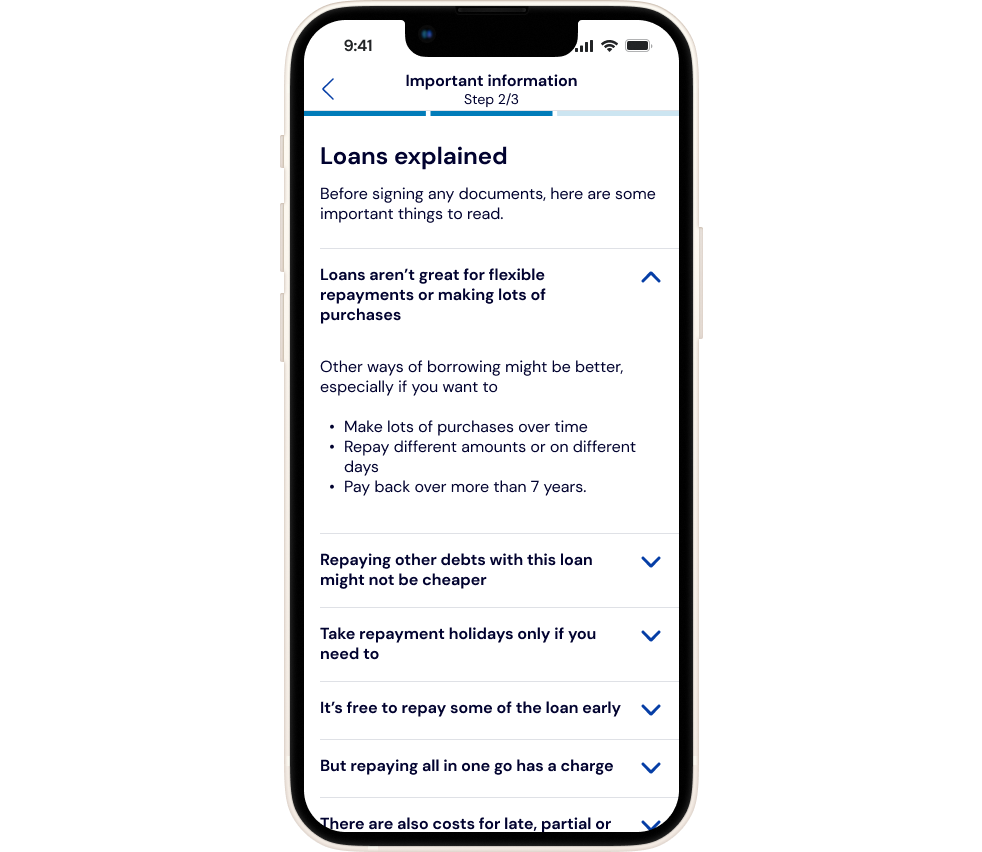
3 documents summarised to covering ‘what you really need to know’
Matching user behaviour
Key information covered in the top & bottom of pages, educational titles meant avoid learning difficult
Layers of detail
Core information displayed on screen, but extra details available by opening accordion
Simplified layout
Reduced cognitive load, clear labelling and positioning helped to guide users where they are in the process
Try the prototype
There’s 3 ways to test it out
Tapping straight on the on the page
Using the figma logo in the bottom left will open it in a new window
Or use the button below
Steps
Tap on the loans and it will flow through the journey
Prompts are turned on to guide you if needed
Inputs figures: Monthly income: £1,500, Financial dependants: up to 4, Monthly rent £750, Outgoings: £350, Childcare: £150, Payment account: First account ,Repayment date: 24th
New design impact
Customers liked it
Lots of good feedback on saying how simple and easy it was to use
Commercially it was a big success
Seeing a 30% uplift in conversion compared to the website journey. Making a material change to sales figures
Continuous optimisation
Since it went live, there’s been opportunities to refine further, reflecting how users are interacting with the different sections, as well as updating to the latest design system patterns.


